7 Best Taupe and Greige Paint Colors in 2024
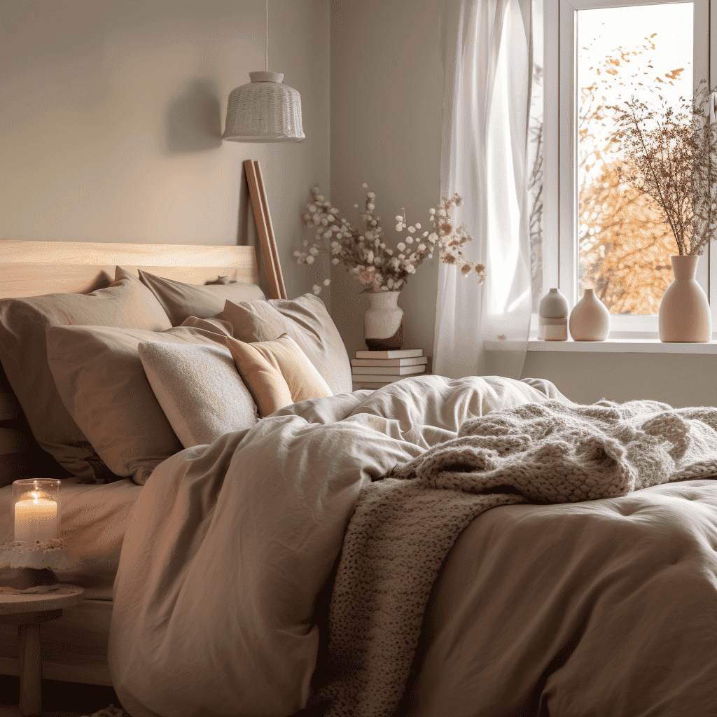
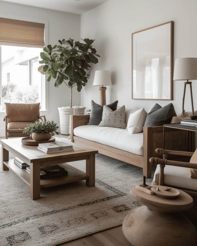
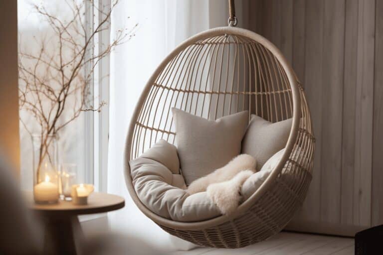
A new era is upon us, and I firmly stand with the uprising of taupe (or, as some call it, greige, but more on that later). It’s time to bid farewell to sterile white walls and the monotony of millennial grey. Instead, let’s embrace the fresh approach of taupe color, which exudes warmth, comfort, and a sense of inviting coziness. Taupe is a versatile color described as a perfect blend of beige and grey. That’s precisely where the term “greige” originates from – combining “grey” and “beige.”
- Color Family: Brown
- Complementary Colors: Blue
- Pairs Well With: All colors
- Mood: Sophisticated, earthy, romantic, soothing
- Where to Use: Wall, trims, cupboards
Taupe is the most underrated color and the secret weapon of top interior designers, but it is a delicate dance with grey and beige. Go too grey and you’re giving jail cell vibes, go too yellow on your beige and your walls will look like baby diarrhea. The key is to pick the perfect fresh and dreamy shade. Get it right, and you’ll live in the new cream dream. Here are our favorite taupe paint colors for your home, no matter your interior style.
1. Farrow & Ball – Stony Ground No. 211

This, undoubtedly, is the absolute epitome of perfection when it comes to taupe color, a creation by Farrow & Ball exclusively tailored for taupe-crazed people like us. Stony Ground is a classic stone color with a slight underlying red that adds warmth and creates a soft beige finish. No matter the lighting or setting, this color will leave you with the sense of serene perfectionism Taupe has to offer.
Combining Shaded White as the trim color with School House White as the accent creates an unbeatable color combination that lends itself perfectly to crafting a warm and minimalist space.
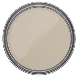
Farrow & Ball – Stony Ground No. 211
2. Sherwin Williams – Shiitake SW 9173
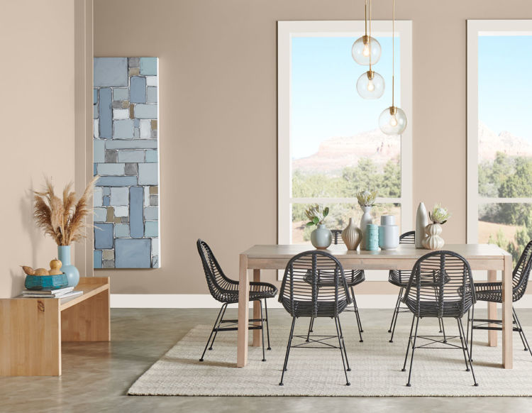
Sherwin Williams Shiitake is a natural and earthy taupe paint color. Shiitake leans slightly more towards brown than gray, complemented by delicate undertones of soft purple and pink. With its mid-range LRV (Light Reflectance Value), it needs a bit more lighting to come to life but still has a lighter appearance than other options.
It will look perfect in a room that receives plenty of natural light, and it might appear slightly darker in spaces with less lighting.
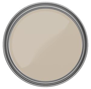
Sherwin Williams – Shiitake SW 9173
3. Benjamin Moore – Upper West Side CSP-70
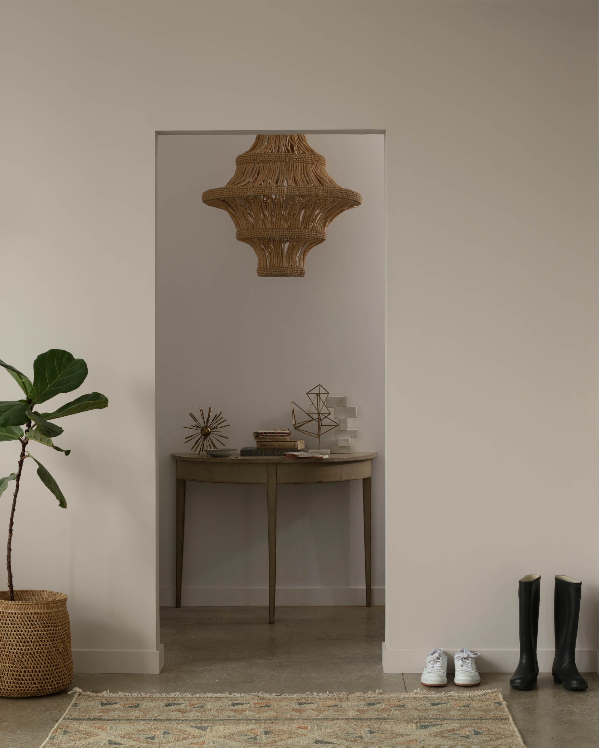
Just as the description says – Completely flexible, very livable. An excellent foundation for chic color combinations. Benjamin Moore’s Upper West Side is a taupe that effortlessly adapts to various design styles, whether it’s used as a neutral backdrop or as a complement to vibrant hues. Its versatile nature allows for endless possibilities when it comes to creating a stylish and inviting space.
A New York-based interior designer, Alec Holland states: “It is the ideal color when you do not want white walls. It is rich enough to create depth and drama, yet it still has a clean brightness to it.”
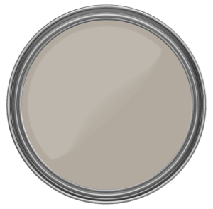
Benjamin Moore – Upper West Side CSP-70
4. Behr – Creamy Mushroom PPU5-13
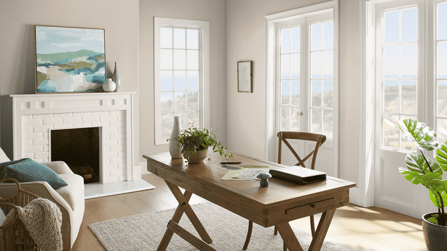
Creamy Mushroom is one mouthwatering paint color that lives up to its name. It’s as delightful to the eyes as it sounds to the ears. This shade is like a creamy dream, making it an absolute winner when it comes to versatility. It’s the color that effortlessly pairs with almost anything you can imagine. Whether you want to create a cozy and rustic vibe or go for a sleek and modern look, Creamy Mushroom has got your back.
Pair this Creamy Mushroom with the delightful New House White from Behr, and you’ve got yourself a match made in heaven! This dynamic duo will transform your space into a haven of tranquility and sophistication. It’s the perfect recipe for a home that radiates warmth and invites relaxation.
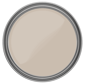
Behr – Creamy Mushroom PPU5-13
5. Farrow & Ball – Slipper Satin No. 2004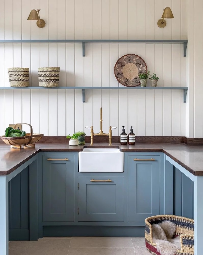
This popular off-white paint color, Slipper Satin, gets its name from the gentle hue of silk found in classical ballet slippers. It doesn’t have any cool blue undertones, so when applied to walls, it often appears as a lovely pale grey, resembling the softness of chalk. This makes it an ideal neutral shade for creating a calming and versatile backdrop in any room. The best part is that Slipper Satin pairs flawlessly with blues and greens, making them excellent choices for accent colors that effortlessly complement and enhance the overall aesthetic.
Take a look at how Jess O’Grady, an Interior Designer in London, brilliantly utilized the captivating Slipper Satin No. 2004 alongside the charming De Nimes No. 299 in this stunning kitchen.
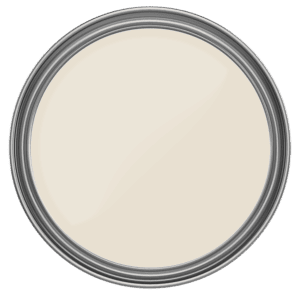
Farrow & Ball – Slipper Satin No. 2004
6. Sherwin Williams – Perfect Greige SW 6073
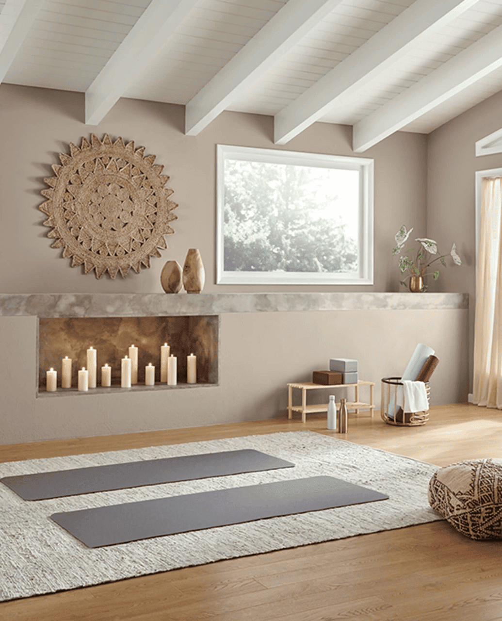
This fabulous taupe color will instantly transform your living room or bedroom into a cozy haven!
This unique taupe shade is a creamy mid-tone gray with red undertones which perfectly balances cool and warmer tones, making it incredibly versatile for any interior space. Its creamy base adds a touch of elegance and sophistication, while the gentle hint of red undertones brings a delightful warmth that exudes comfort.
If you want to take your interior design game to the next level, this taupe color is the secret ingredient you’ve been looking for. It’s a true chameleon, adapting to different lighting conditions and enhancing the overall ambiance of your space.
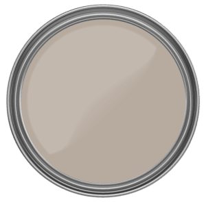
Sherwin Williams – Perfect Greige SW 6073
7. Farrow & Ball – Dimity No. 2008
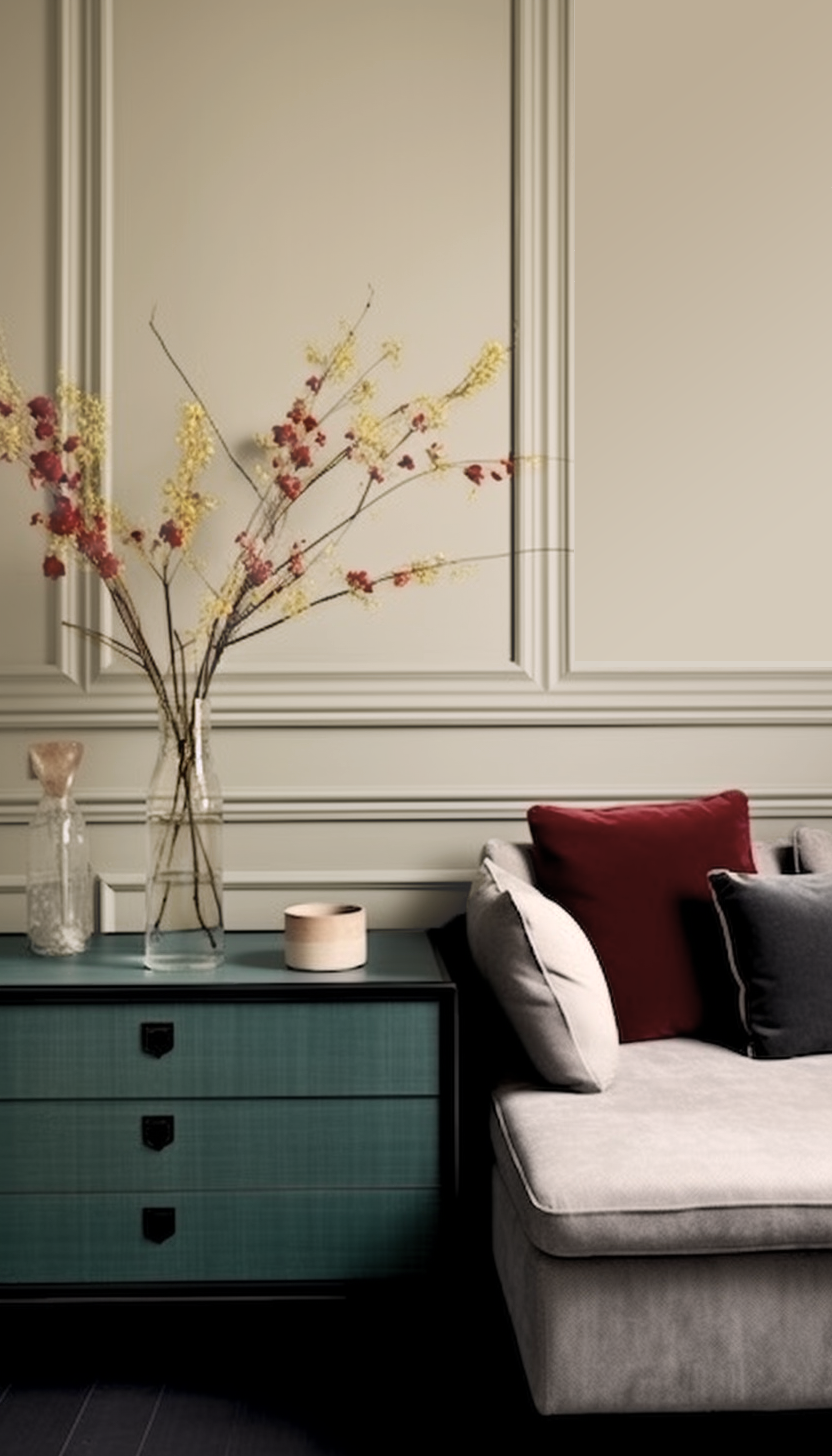
If you’re in search of a lighter taupe, leaning more towards the lighter end of the spectrum, Dimity is undoubtedly the perfect choice for you. This exquisite color is like a breath of fresh air, gently infusing your space with a sense of purity and tranquility.
Dimity is named after the lightweight cotton fabric originally used to make ladies’ bustles, but it is now more commonly used for bedding. Dimity is a pale and subdued taupe brimming with unmatchable depth, making it perfect to combine with the limestone, leather, and linens often used in contemporary homes.
Pair it with a complimentary accent color like Pelt for a bolder look, or combine it with Pointing for a softer and refreshed vibe.
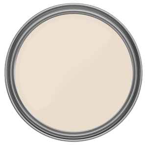
Farrow & Ball – Dimity No. 2008
Paint Color Comparison
Examine the undertones closely; you’ll find some colors have more brown undertonea, while others lean towards a cooler, greyer palette.

Taupe vs Greige
The distinction between taupe and greige has sparked a debate among color enthusiasts. Some argue that taupe tends to be more on the brown-grey spectrum, while greige leans towards beige-grey.
Taupe is a blend of brown and grey tones, creating a warm and versatile color that frequently resembles natural earth tones. However, it may also have a pink or purple undertone, so it’s important to be mindful of that. On the other hand, greige strikes a delicate balance between grey and beige, providing a cool tone and a contemporary ambiance to any space. Greige often exhibits blue or green undertones, which contribute to its cool undertone.
While this debate may appear nuanced, the contrast between taupe and greige influences interior design choices and color schemes. Both colors have slight variations, and knowing the difference helps when picking the right one for your home’s look and feel.
In the end, it all comes down to personal preference and the unique vision you have for your home.
Lighting Matters
One crucial aspect to bear in mind is that paint can appear distinct in each space. No two spaces are alike when it comes to the amount or type of light they receive – whether the room faces east, west, north, or south. Therefore, testing the shade of taupe in the specific room where you intend to apply it is of utmost importance.
Allow the paint to dry completely and take the time to observe it at various times of the day. Lighting conditions can vary significantly from morning to afternoon to evening, and these variations can impact how the paint color appears. You might notice an undertone that you didn’t initially perceive, and it could be something you dislike, especially at certain times of the day.
By conducting this paint testing process, you ensure that you make an informed decision and avoid any unpleasant surprises once the paint is already on the walls. Taking the time to assess the color in different lighting conditions helps you choose a paint that truly harmonizes with the space and fulfills your desired aesthetic.
Remember, patience in this process pays off, and it’s well worth the effort to ensure that you create an environment that resonates with your vision and brings the desired atmosphere to your living spaces.
In Conclusion
The journey of choosing the perfect paint color can indeed feel overwhelming, but there’s no need to worry. Take a deep breath, relax, and remember to take it one step at a time. The key is to start with paint samples – they become your invaluable tools in analyzing how color truly behaves within the space.
As you observe the samples under different lighting conditions, you’ll find that one color stands out, capturing your attention and resonating with you on a deeper level. It’s a feeling that comes from your heart, an instinctual connection that tells you this color is the right one for your space.
At times, it might not be the color you had initially envisioned or the one you thought you would choose. Trust the process and trust your instincts. Embrace the possibility that the color that speaks to your heart might be a surprising choice, and that’s okay!
Often, the best decisions are the ones that stem from a gut feeling and an emotional connection. That color that ignites a spark within you is the one that will bring joy and contentment to your living spaces.
So, as you embark on this paint-picking journey, remember to be patient with yourself and the process. Take your time and listen to your heart. In the end, the paint color that speaks to your soul is the one that will make your home a place of comfort, beauty, and personal expression. Trust the journey, and you’ll undoubtedly find the perfect paint color that turns your house into a home you truly love.

