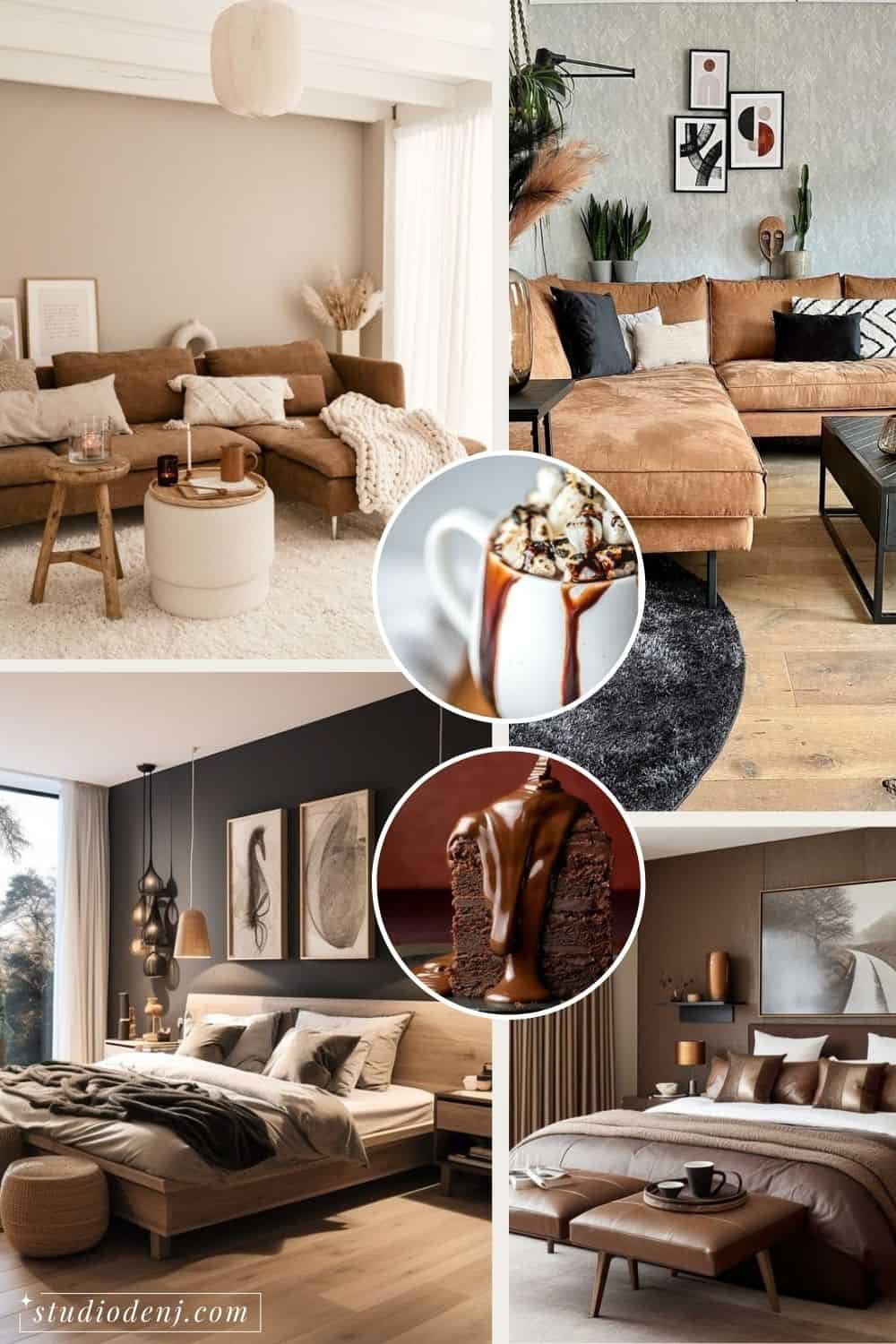
How to Choose the Perfect Interior Color Palette for Your Home
The perfect color palette for every space.
Have you ever found yourself standing in the middle of a paint store, overwhelmed by the seemingly infinite shades of white? Or you’ve collected more paint swatches than you have friends. Choosing the perfect interior color palette for your home is like picking the right flavor at an ice cream parlor, or choosing the right Netflix show for the night – a delightful but difficult challenge.
But fear not, for I’m here to guide you through the maze of hues to help you create an interior color palette that suits your space and speaks volumes about your unique personality.
Why do you need an Interior Colour Palette for Your Home?
When designing a space I almost always approach the same way and that is nailing down and figuring out the color palette. Why? Because color is one of the first things that our brain processes when it looks at a space. Our brain is actively and constantly making connections. When we look at a space our brains are immediately making connections between colors and shapes.
Crafting an interior color palette for your home is about intentionally selecting a group of colors that reflect your style and complement each other, and dispersing them throughout your space to make connections within the color palette itself.
Color is so important. The reason why eclectic or curated spaces can look very cohesive is that they share a color palette, even with different styles combined in one space.
Why is it important to choose an interior color palette from the get-go?
- Your color palette acts as a compass, guiding your decisions when selecting furniture, decor, and even smaller details like throw pillows or rugs.
- It streamlines the decision-making process, making each choice purposeful and aligns with your overall vision.
- You can save money and time by choosing the correct items the first time.
Step-by-Step Instructions for Perfect Layering in Interior Design
01.
Understand the Basics of Colour Theory
Color theory can be quite complex, and I won’t delve into all the details. However, understanding the basics might help you in choosing the right colors depending on the mood you want to create. Just bear with me for a bit, it will all become clear in the end.
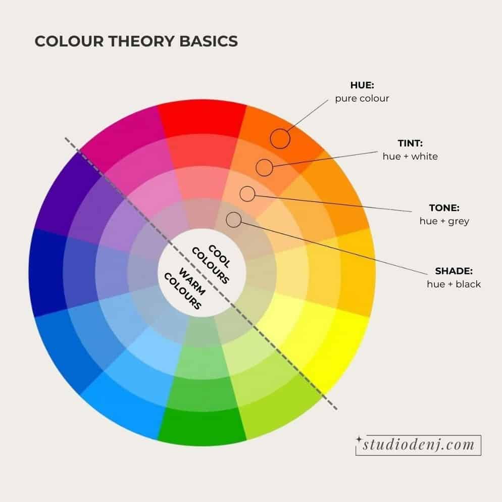
The color wheel is like a cheat sheet. It shows us exactly what each color does and how it behaves. It’s a handy tool for figuring out the vibes each shade brings to the table.
Color Terms and Definitions
The terms might sound a bit foreign, but I’ll do my best to break it down for you.
Warm and cool colors are the temperature of a color. No hard and fast rule says you can’t mix cool and warm colors. Sometimes a cool-toned space can benefit from a pop of warmth, and vice versa. It’s all about finding that balance.
- Cool Colours: Hues green through purple, including most greys. Cool colors recede or fade, so they make rooms feel bigger. These colors are cool and relaxing. These can also be materials like concrete, glass, metal, stone, and tiles.
- Warm Colours: Hues red through yellow, which includes most browns, beiges, and tans. Warm colors are active and stimulating. They are especially good at making items pop. Warm materials include textiles, bamboo, wood, and clay.
We use tints, tones, and shades of colors to add depth and dimension to a space. If you are only using one flat shade, the space can feel monotonous and lack visual interest.
- Hue: another term for color. The pure color.
- Tints (color + white): Tints, which are lighter versions, bring brightness and airiness to a space.
- Tones (color + grey): Tones, being more saturated, provide a sophisticated and balanced look.
- Shades (color + black): Shades, the darker counterparts, add richness and depth.
Different Colour Schemes
These are the fundamental and widely recognized color schemes. Regardless of the scheme you pick or the style of your house, as long as the colors flow together cohesively, your space will come together.
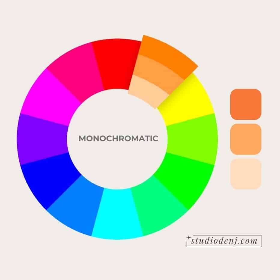
Monochromatic
One color from the color wheel is repeated in various shades (darker versions of the color) and tints (lighter versions of the color). You can have just one paint color repeated through your home in different shades for a very easy, calm, and minimalistic color palette. To do this, simply choose one paint card with colors ranging from light to dark, and go from there.
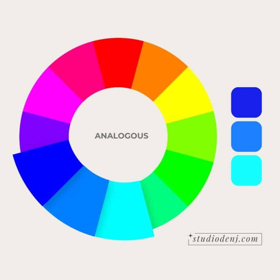
Analog
Three colors lie next to each other on the color wheel—for example, green, aqua, and blue. . Using these colors together creates a harmonious and comfortable vibe. When using more neutral tints, this rule will bring you very close to a monochromatic color scheme.
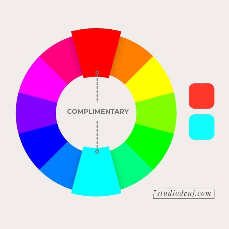
Complimentary
This scheme uses opposite hues on the color wheel to create a bold statement. It’s best in complementary color schemes to allow one color to be more dominant, while the other color provides pops of interest. You can also use the undertones in neutrals to create a complementary color scheme—for example, a warm cream has yellow undertones that will complement blue. This color scheme provides a perfect balance to maximize contrast and project stability.
Now that you’ve got the gist of the basic color theory, let’s dive into the exciting part – the actual hands-on work!
02.
Take stock of existing colors and elements
You might not realize that you already have a color palette. If you consider everything that’s already in the room and the elements you would like to keep, that is going to be part of your interior color palette. For example, the flooring, built-in cabinets, and large pieces of furniture are permanent, so including them in your color palette is essential to create a cohesive space.
Take your floors, for instance; they’re likely the most significant fixed element in a room. Whether it’s the color of the tile or the undertone in the hardwood – be it a warm, orangey pumpkin pine or a cool, neutral grey – it’s already a player in your color scheme. As you craft your whole house color palette, factor in its place on the color wheel.
If you don’t like the color of your floors, don’t exclude them from your palette. Instead, work with it and add small elements of the same color throughout the space to create cohesion.
Are there any furniture or decorative items you would like to keep, like a painting, rug, or pillows? Add them to your color palette and add rhythm by including splashes of the same colors throughout your space to pull the room together.
Julie Jones is an excellent interior designer who explains this so well in her videos.
03.
Find Inspiration and Your Aesthetic
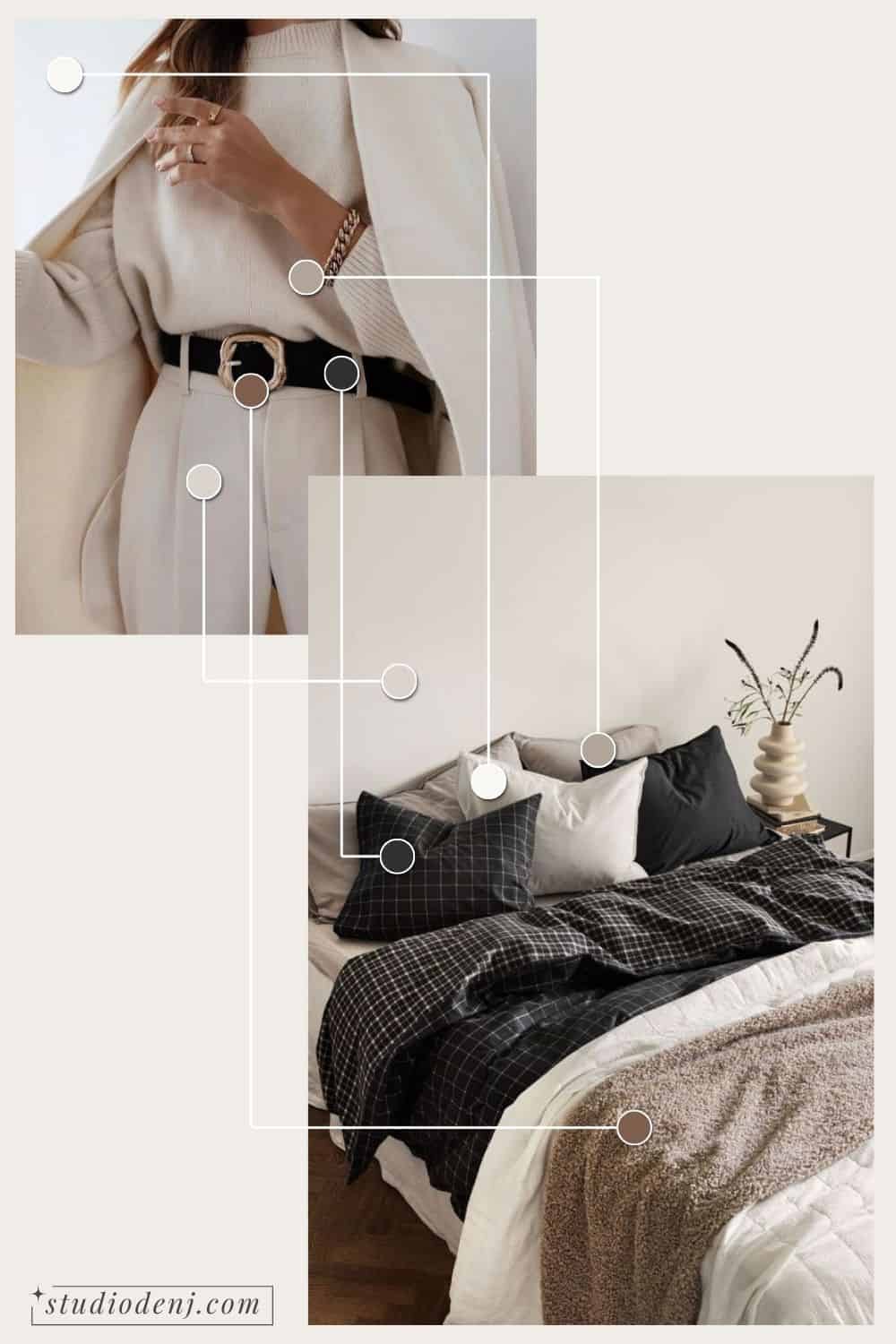
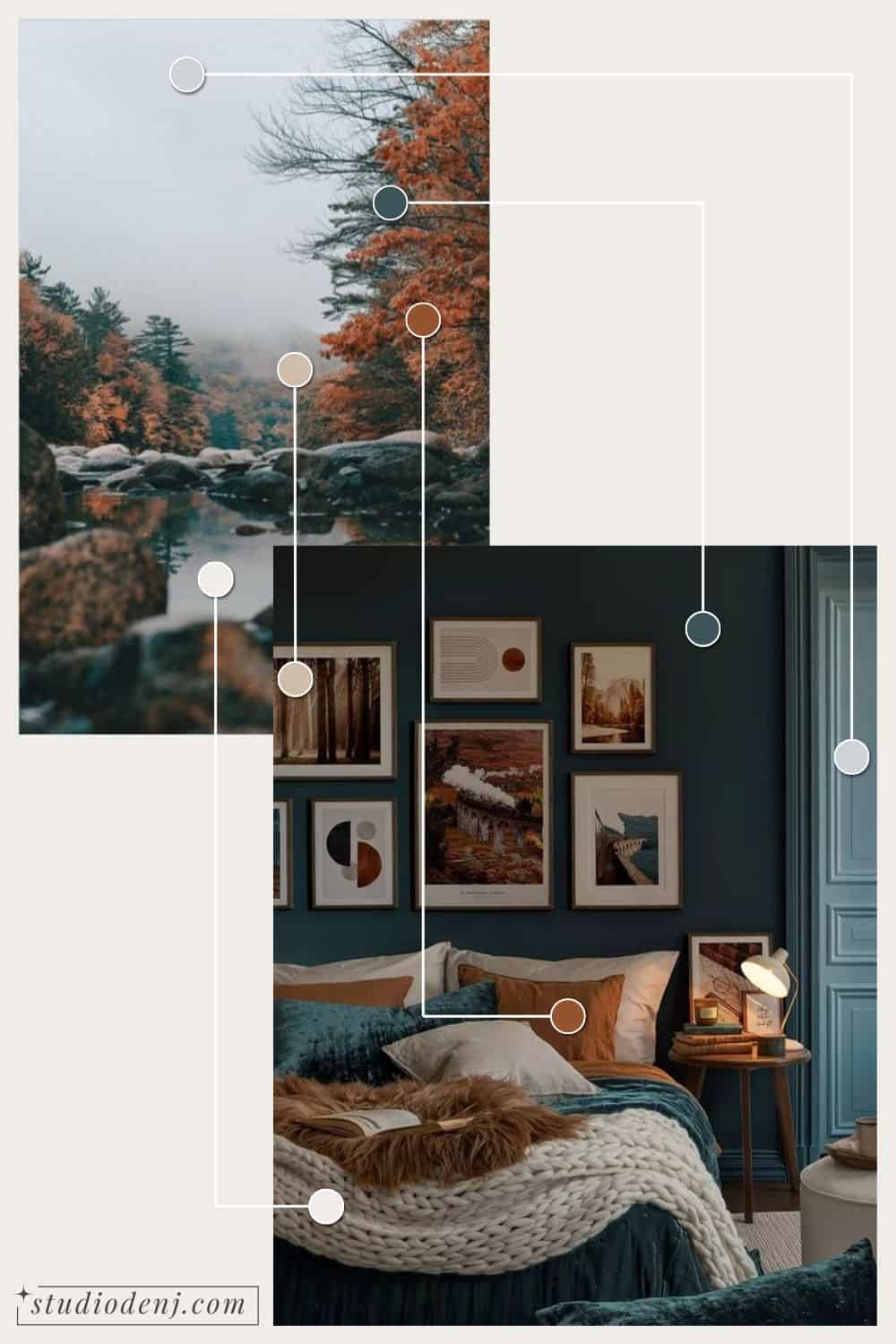
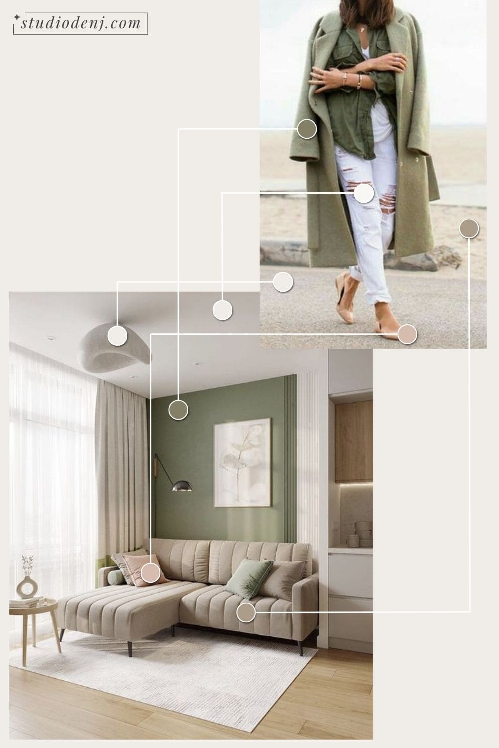
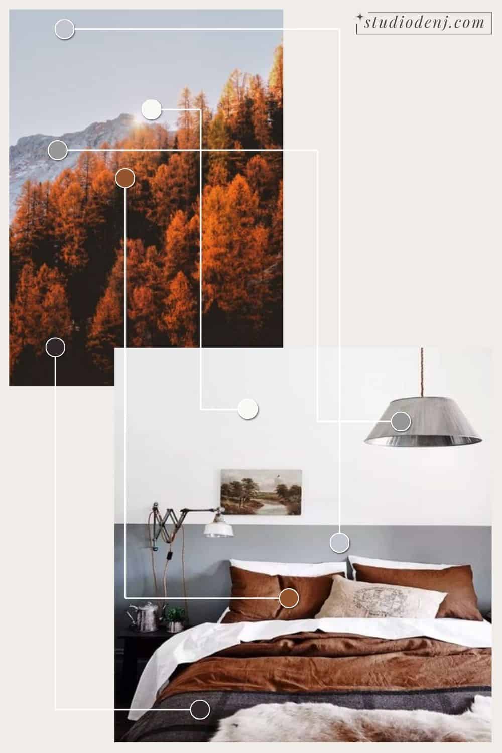
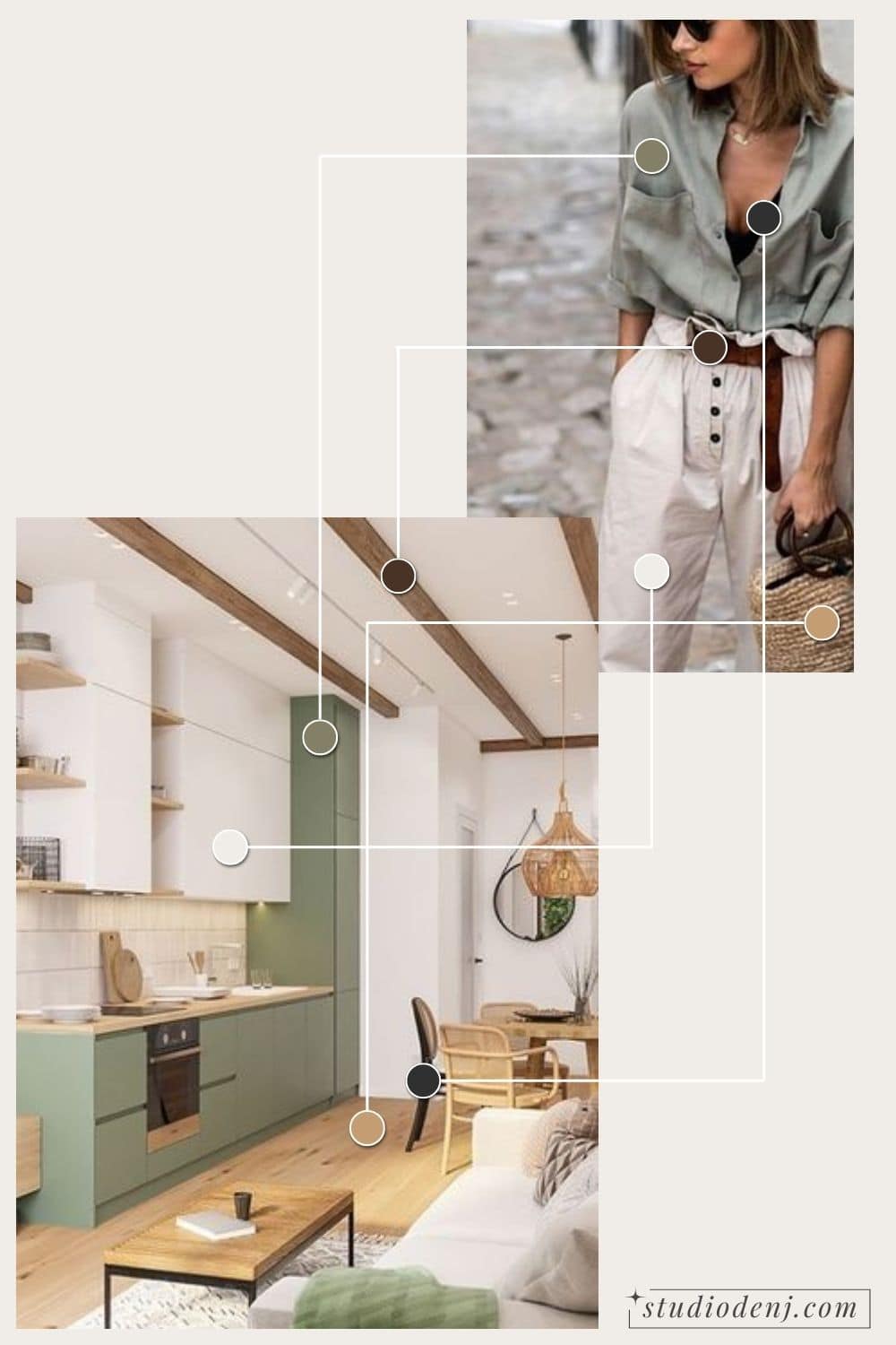
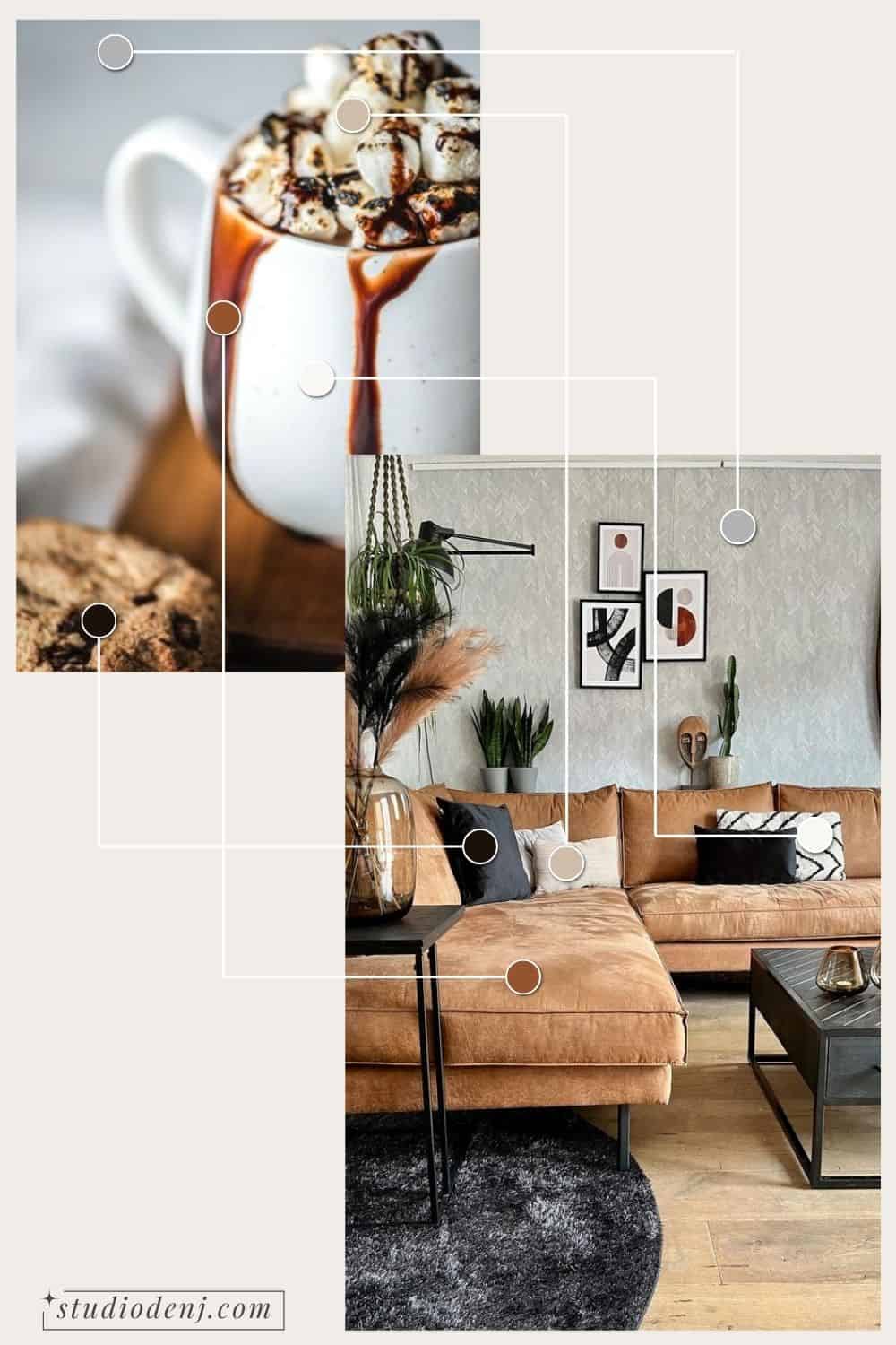
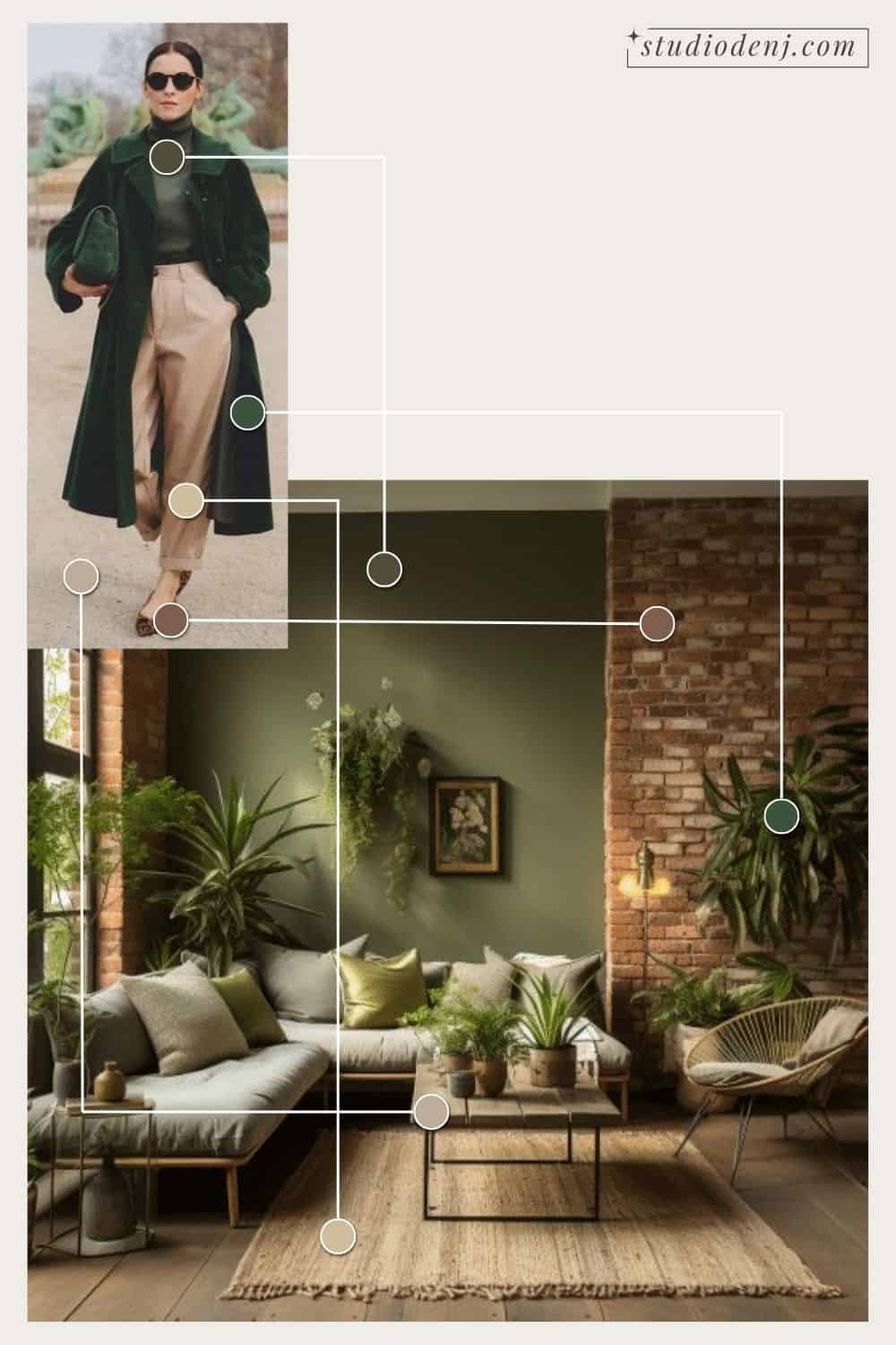
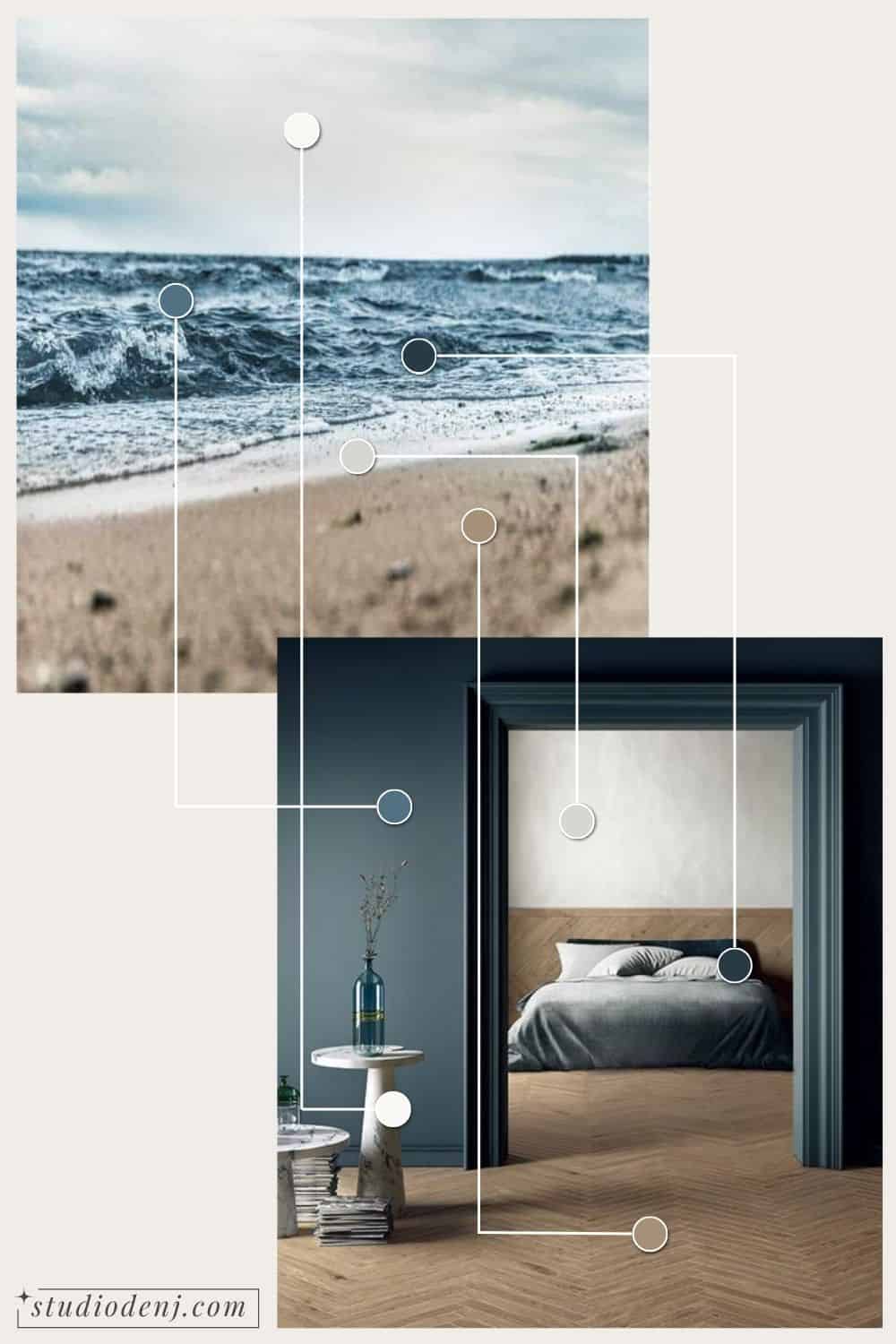
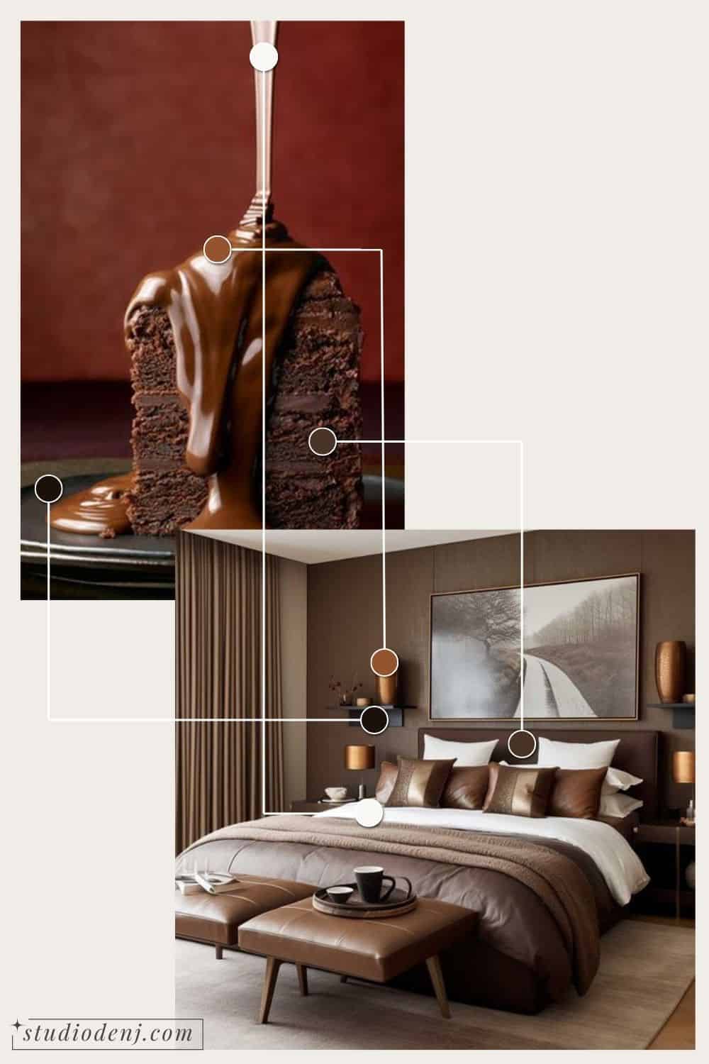
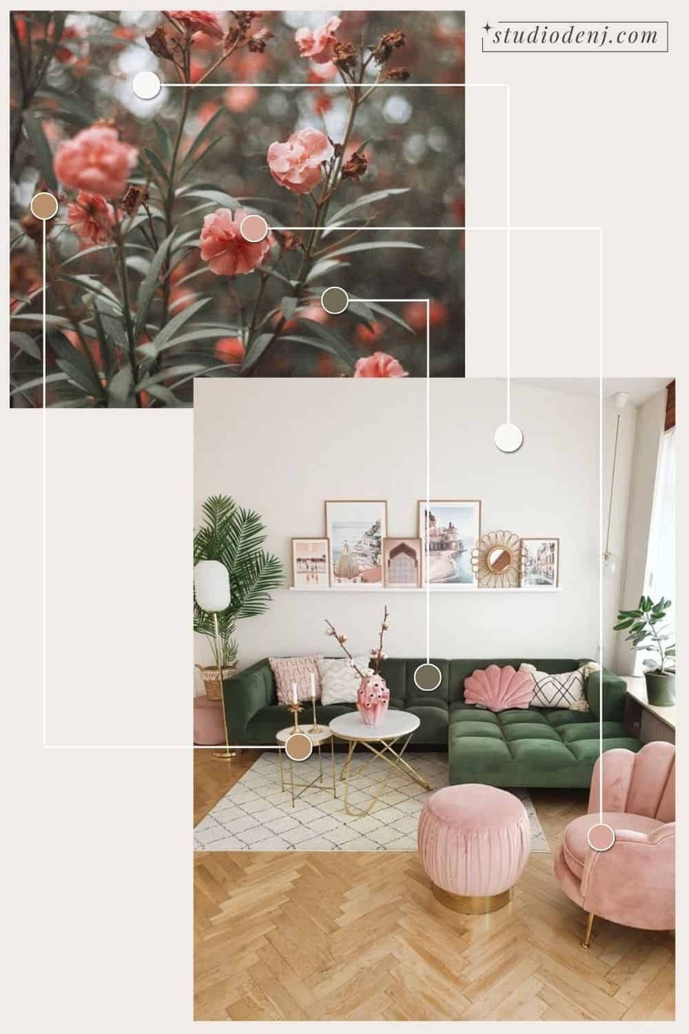
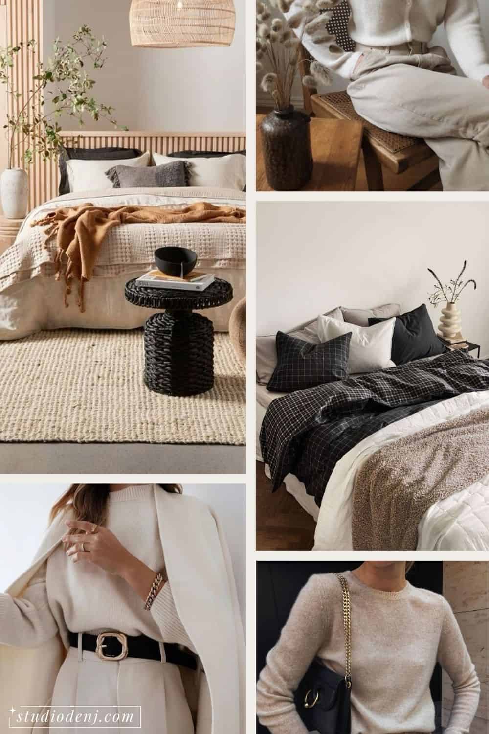
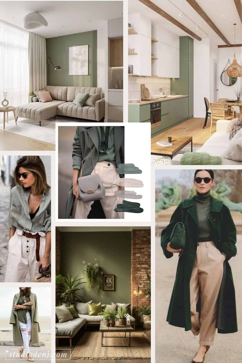
Finally! Let’s dive into the enjoyable part! Now that you know how colors work together, you can start with your quest for inspiration. Begin by creating a Pinterest board. If you’ve got pictures of your existing elements (see step 1), upload them. Then, let loose and start pinning anything that visually grabs you. It’s not just about interior decor – go ahead and pin outfits, paintings, or even pictures of your favorite food. The goal is to capture a broad range of the aesthetic you’re drawn to. Don’t overthink it; just keep pinning!
Once you’ve built up your board, take a step back and look for patterns. Are certain colors or elements popping up frequently? Make a list of what catches your eye. This process is all about letting your taste and style shine through.
04.
Decide what vibe you want for your home
Now that you know what your preferred colors, taste, and style are, think about how you want the room to feel. For example, do you want your space to feel:
- Calm & relaxing
- Warm and cozy
- Moody and dramatic
- Neutral with fun pops of color
Check out your inspiration hub and focus on what captivates you the most. Merge that with the color theory insights you’ve picked up, and you’ll begin to see the direction you should head in. For example, if you would like a calm and relaxing space, try saturated and neutral colors. Avoid bright colors, they stimulate the senses.
05.
Choose Your Interior Color Palette
The moment has arrived – time to select your color palette!
How many colors should you choose?
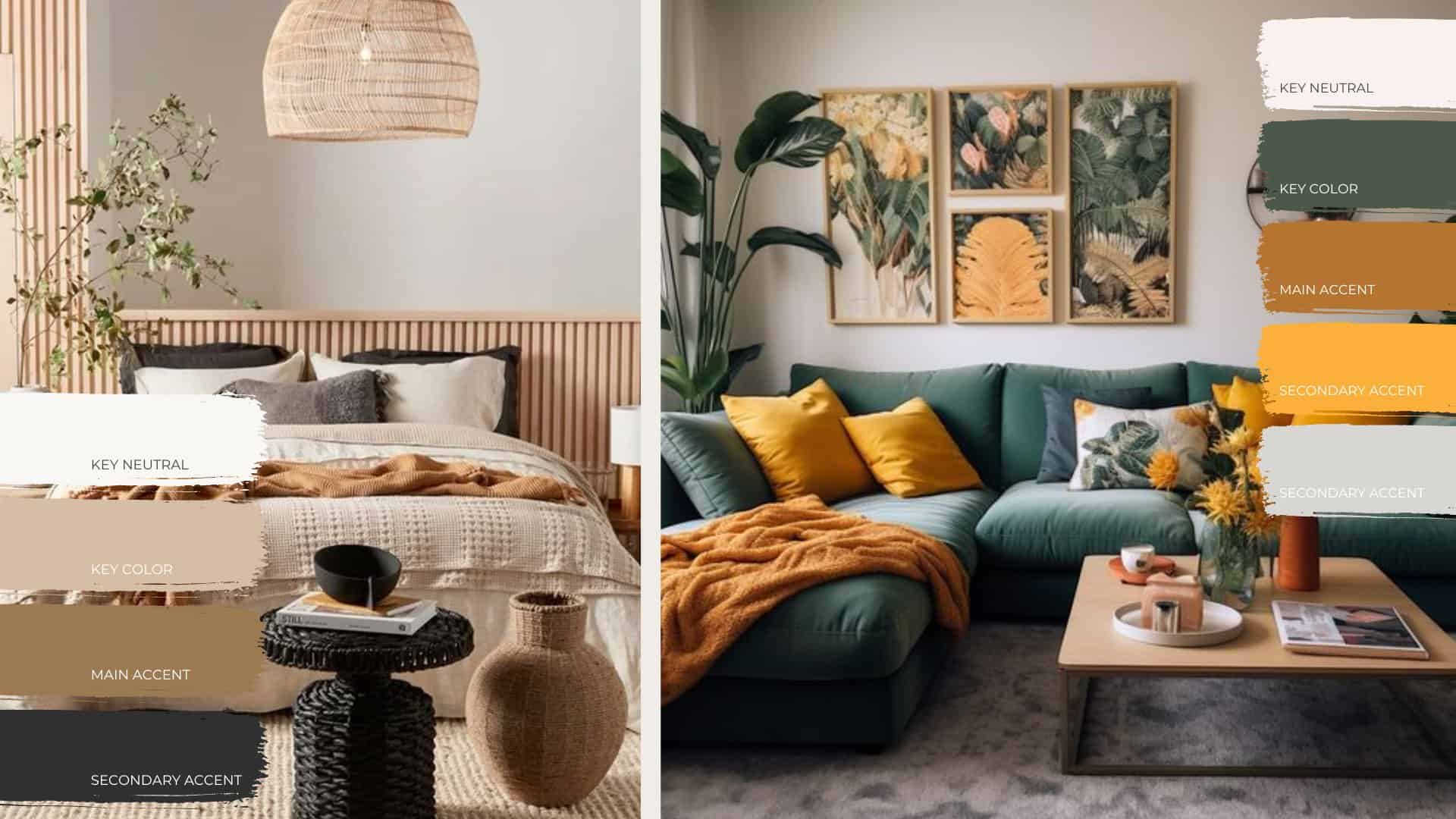
How many colors you choose to have in your interior color palette is going to be up to you, but I like to stick with around three to five. If you go over it starts to become a little overwhelming and three might look a little too flat.
So how much of each color in your color palette should you use in your space?
There are no rules for this because there are no rules in design, but I do like to break it down into percentages. There are two ways to look at this, so decide for yourself which one resonates with you. Don’t get too hung up on the numbers, it’s just a basic guideline.
- The 60/30/10 rule.
- 60% – Walls and floor
- 30% – Furniture, rugs, curtains
- 10% – Trims, mouldings, décor
- The 100% rule
- If you have five colors and need to use 100% of each of those five colors, and you use 30% on one item and 30% on another item, therefore, you mainly need smaller items to complete out the 100% of that color
- Or if you use 70% of a color on a wall, and 20% on a sofa, then only 10% is needed in small decor items.
I know it can seem confusing, but the main idea is to evenly disperse each color throughout the space so it is not all clumped together in one area. That’s what’s going to keep your eye moving and make connections.
Main Colours
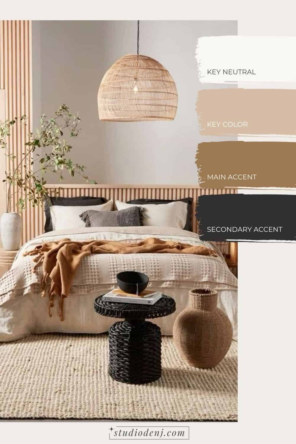
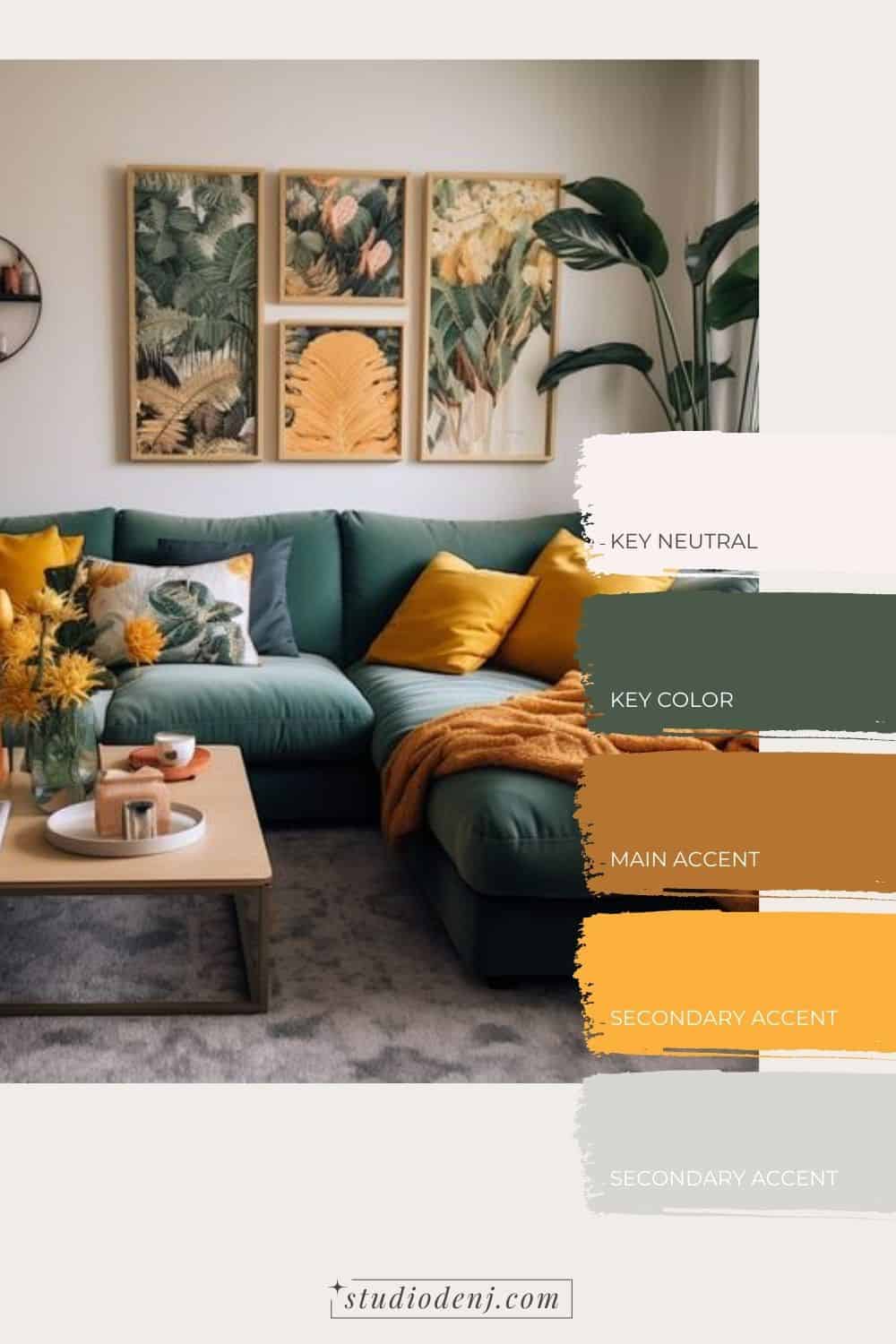
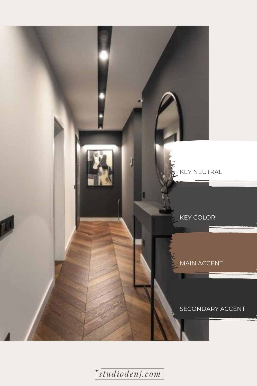
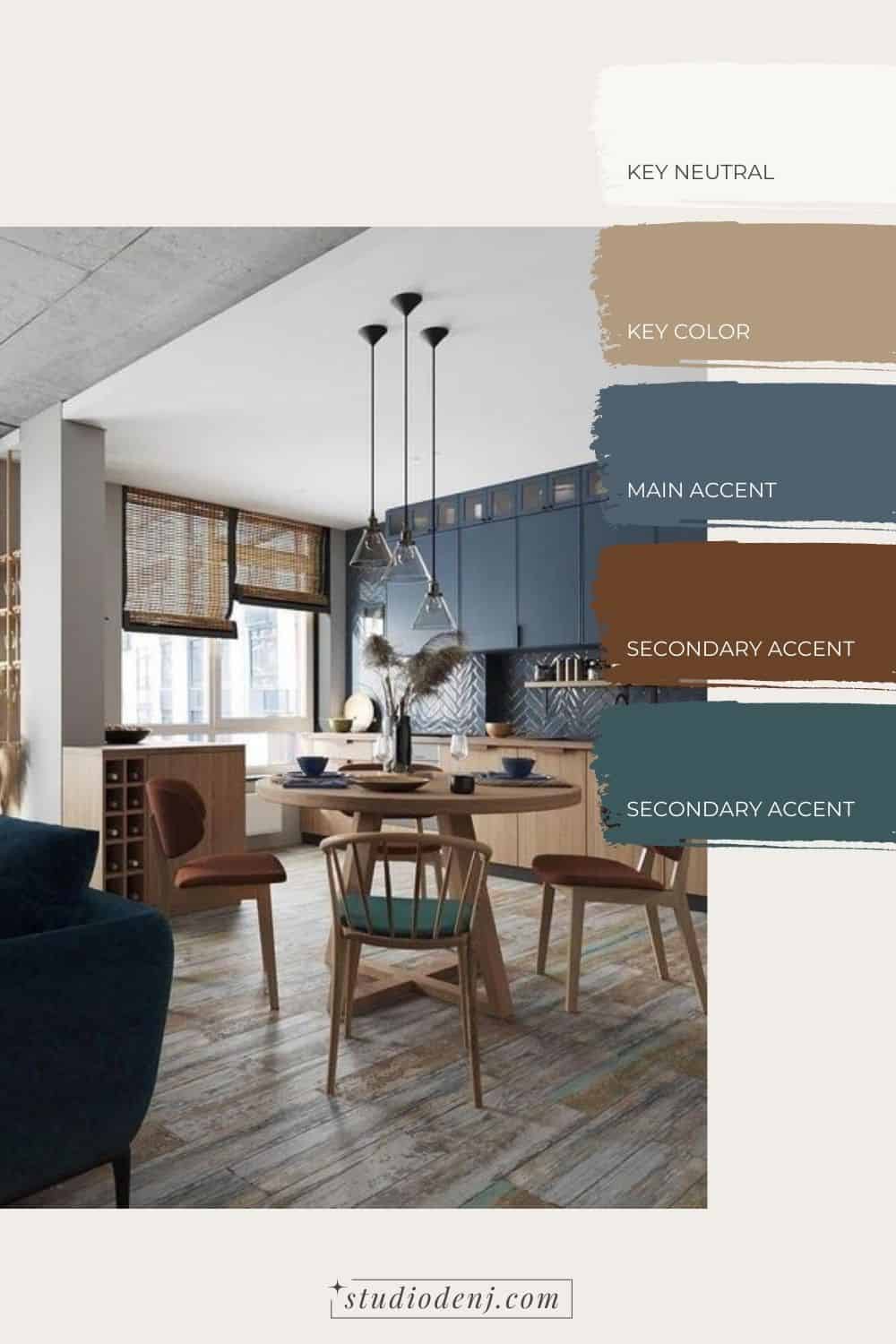
Once you have your 3-5 colors picked, choose 2 colors as your main colors. These colors are the 60%, the largest area, and the most visible in the layout. The key colors are often neutrals but not necessarily, depending on the style you are going for. If you are more of a minimalist and like things airy and bright, then your key colors might be shades of white, grey, or beige. If you are a bit bolder, It might be a dark green, a warm orange, or a cool blue.
Accent Colours
These remaining colors are your play zone, often found in changeable finishes like accessories, smaller furniture pieces, and textiles to make brain connections, remember? They’re the ones that inject life into the room, tying everything together. If neutrals are your main colors, this is where you sprinkle in pops of color. You’d usually work with up to two of these accent colors, with three being the absolute maximum.
A good rule of thumb is to have one neutral, one white, and one darker, contrasting color. For the final two, the choice is yours! I lean towards neutrals for my main colors and go bolder when it comes to accent colors. For example, l paint my walls neutral, the trims white and the doors a darker, contrasting color, while a statement chair or accessories provide the accent colors.
Wood, Stone, and Metal Finishes
Consider the fixed finishes you already have; these might include wood, stone, and metal elements in your space. If some are already determined, work with them instead of against them. For wood finishes, consider the ones already in play and add one or two more, depending on your furniture situation. Stone finishes, like countertops or tile floors, might already be set, so work within those parameters. Metal finishes, with undertones ranging from warm (gold, brass) to cool (chrome, silver), and neutral (black), should be selected carefully. Warm metals pair well with warm tones, and cool metals with cool tones. In a room, aim for one or two metal finishes with contrasting undertones for a cohesive look.
Use an Online Colour Palette Generator for Interior Design
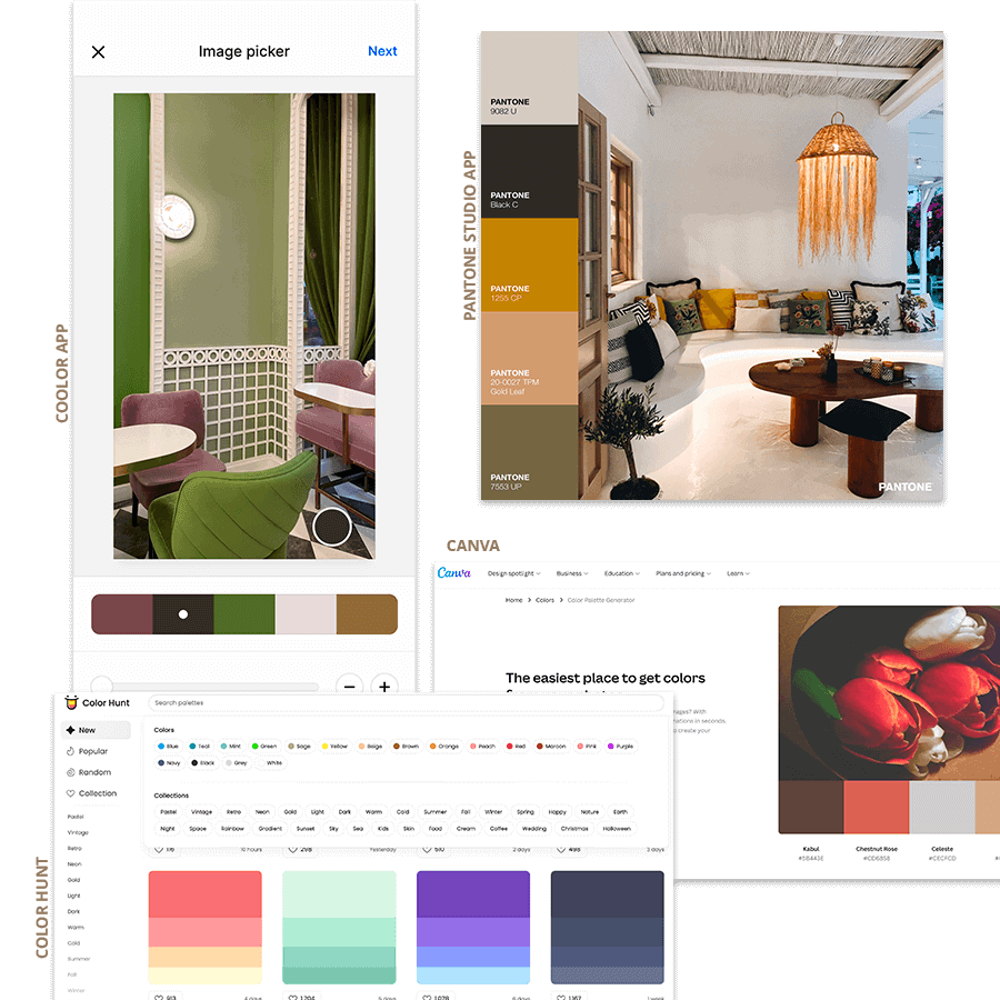
- Coolors app: Probably the best and most powerful way to select your interior color palette. You can easily pick colors from a picture on your phone. The app will preselect 5 colors for you but you can play around to see what works best. Or simply browse the app’s library with thousands of color palettes created by other app users.
- Pantone app: Same with the Pantone app. You can easily change the colors the app has preselected.
- Canva: has now developed an easy and quick tool to extract colors from your photos. Only, you can not select the color of the picture you want to select. Canva will decide for you which colors to add to your palette.
- Color Hunt: Color Hunt has a nice library of colors. You need to submit your colour palette before it’s published on their website which ensures a certain quality. Also, their search tool is pretty useful as you can search palettes by colors.
Key Considerations For Successfully Choosing an Interior Color Palette
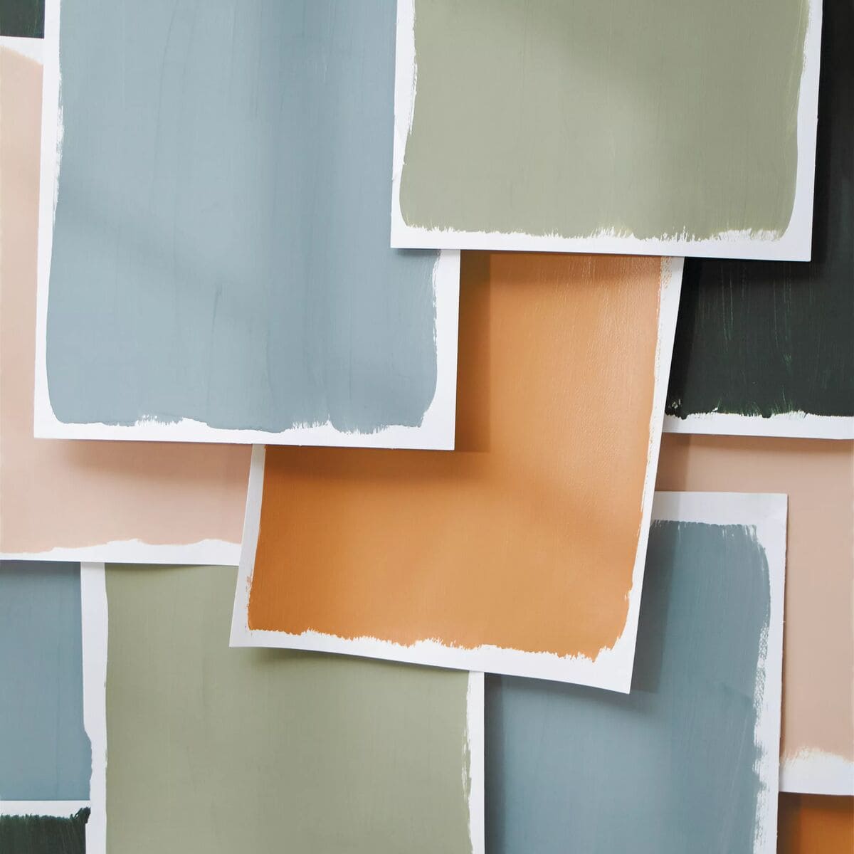
Test Your Lighting with Large Color Swatches
Testing your paint color before diving into painting a room is VERY important. It’s essential for a few reasons:
- Lighting Variation: Colors can look different under various lighting conditions. Testing helps you see how the paint behaves in natural light, artificial light, morning, evening – you name it.
- Undertones Discovery: Sometimes, a color you thought was straightforward might surprise you with hidden undertones. Testing allows you to catch these subtleties and adjust if needed.
- Room Interaction: Paint interacts with a room’s existing elements – furniture, flooring, etc. Testing helps you gauge how your chosen color plays with the room’s overall vibe.
- Personal Satisfaction: It’s all about making sure you genuinely love the color in your space. Testing gives you the chance to live with it for a bit before committing to the whole room.
That’s a wrap…
Hooray, you made it through this post—quite the read, huh? Applying what you’ve learned might take some time, and that’s okay! Take all the time you need, and don’t hesitate to make mistakes and tweak things along the way. That’s why it’s wise to invest time in creating a mood board and testing those paint samples before locking in your final paint scheme.

Deidré Barnard
Deidré Barnard is a qualified and practicing interior designer who absolutely loves every aspect of her job and specializes in 3D Visualization. Deidré believes that interior design and decorating should be demystified and accessible to everyone. She shares daily doses of home decor, inspiration, and interior styling tips that will inspire you to take on your own design projects with confidence.
What do you think?
A penny for your thoughts?

